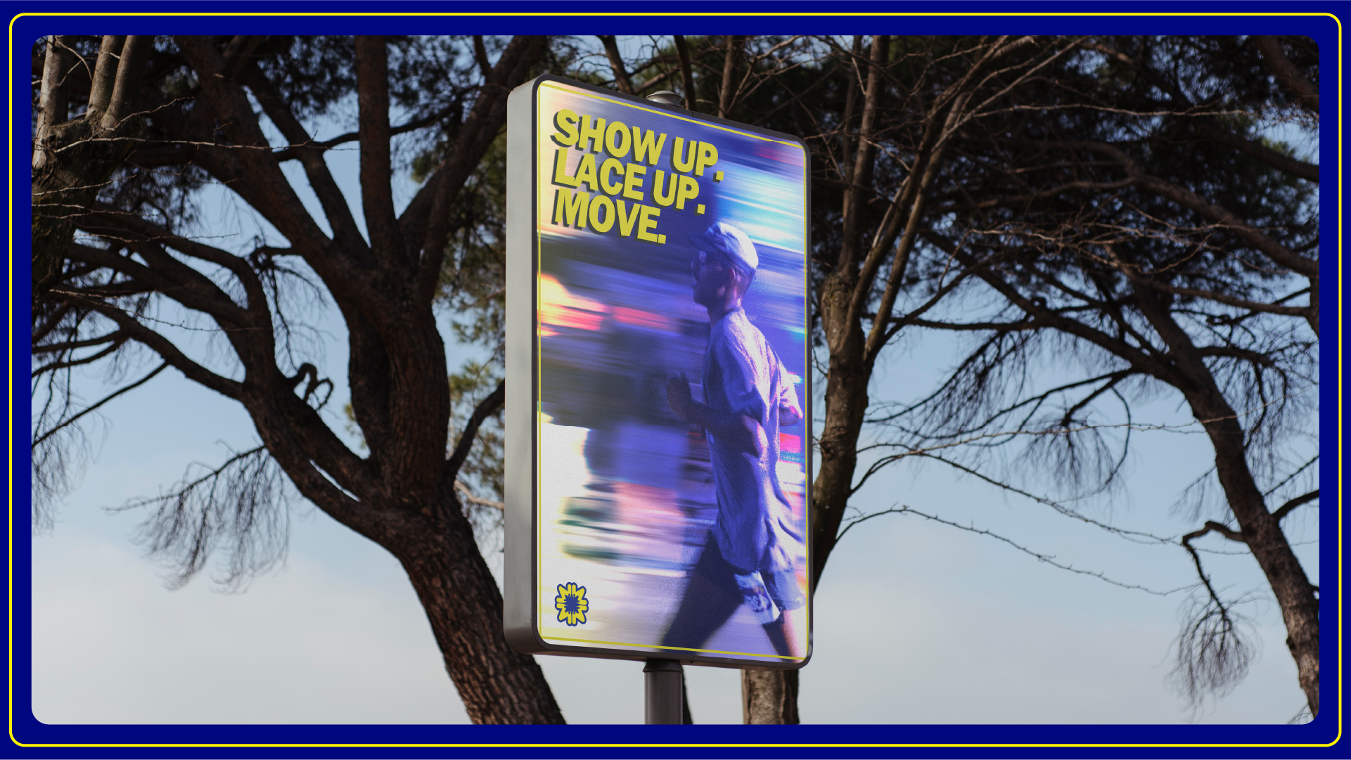
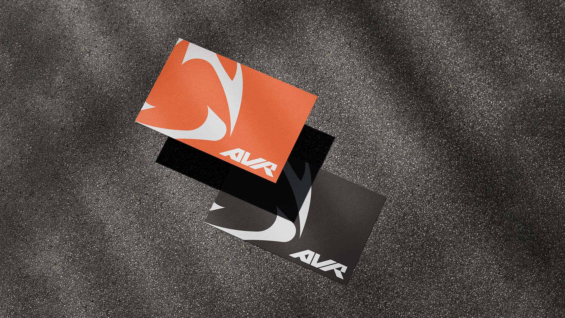
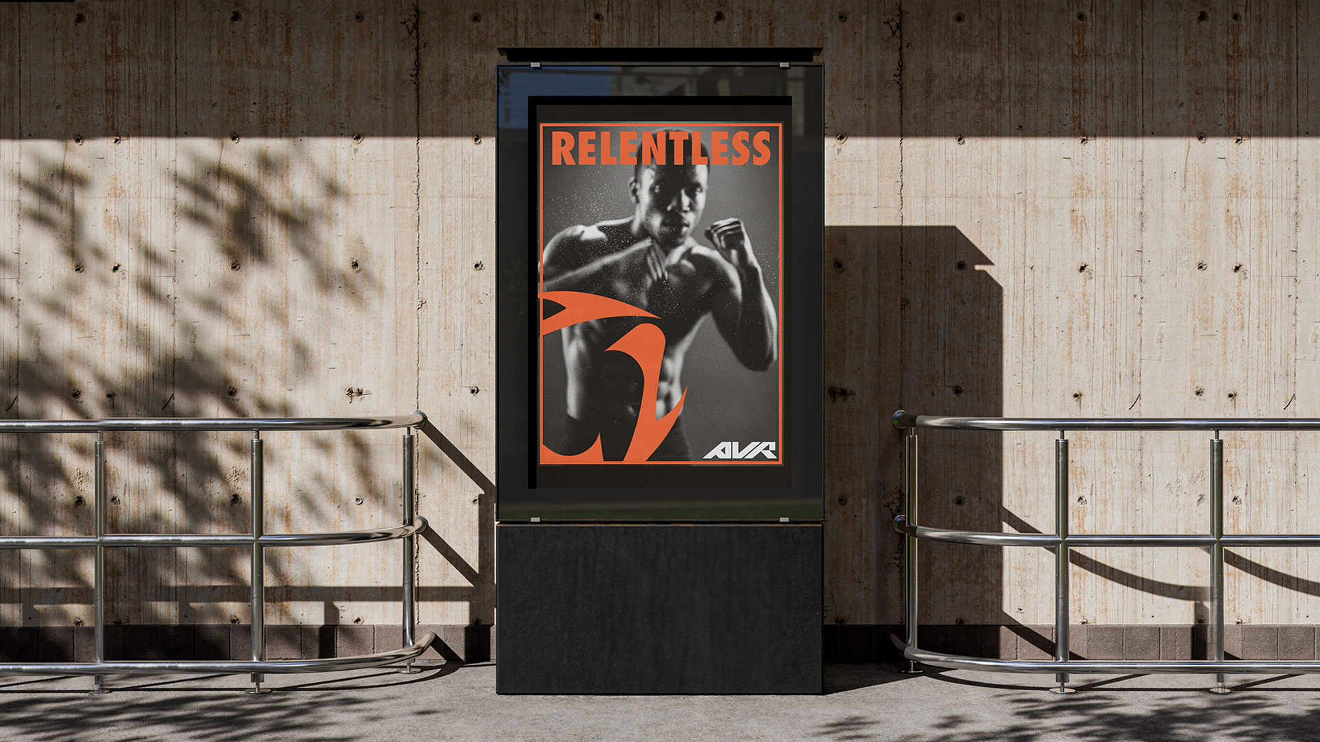
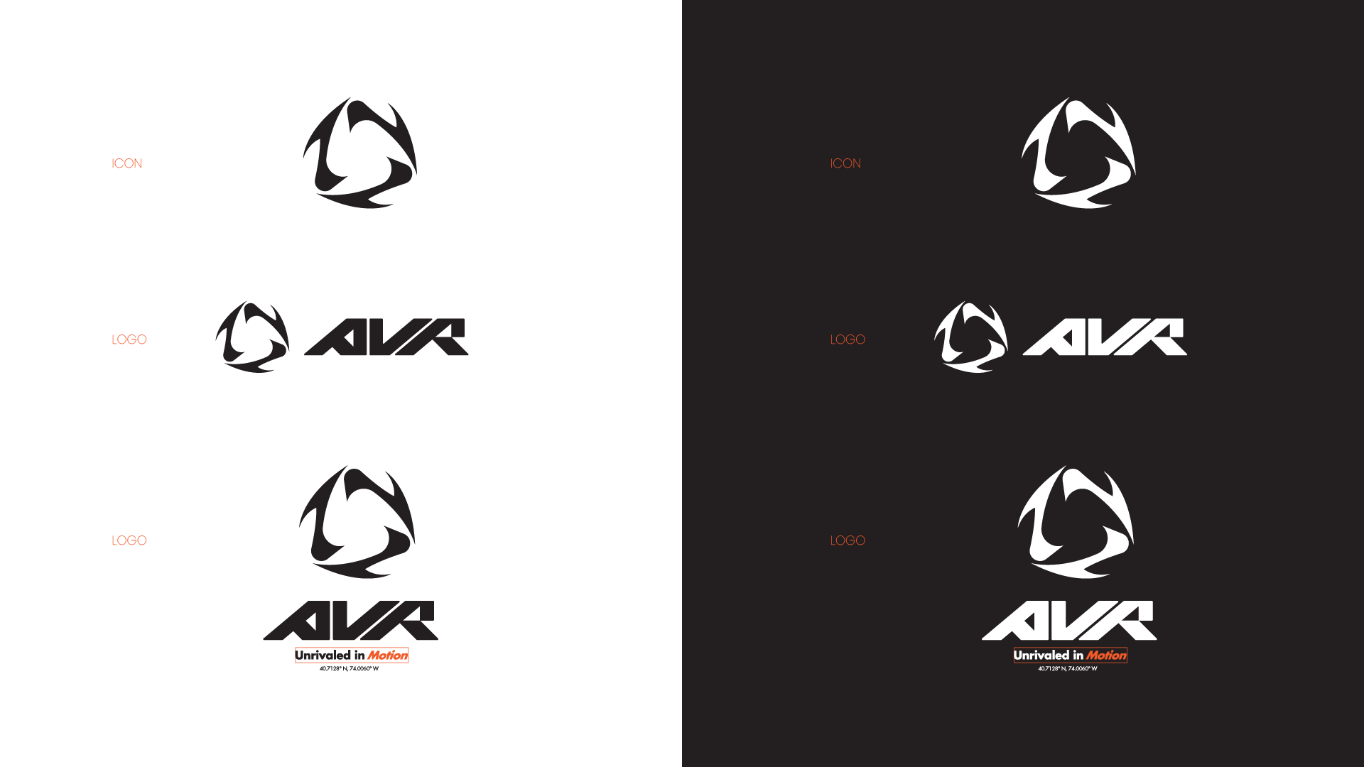
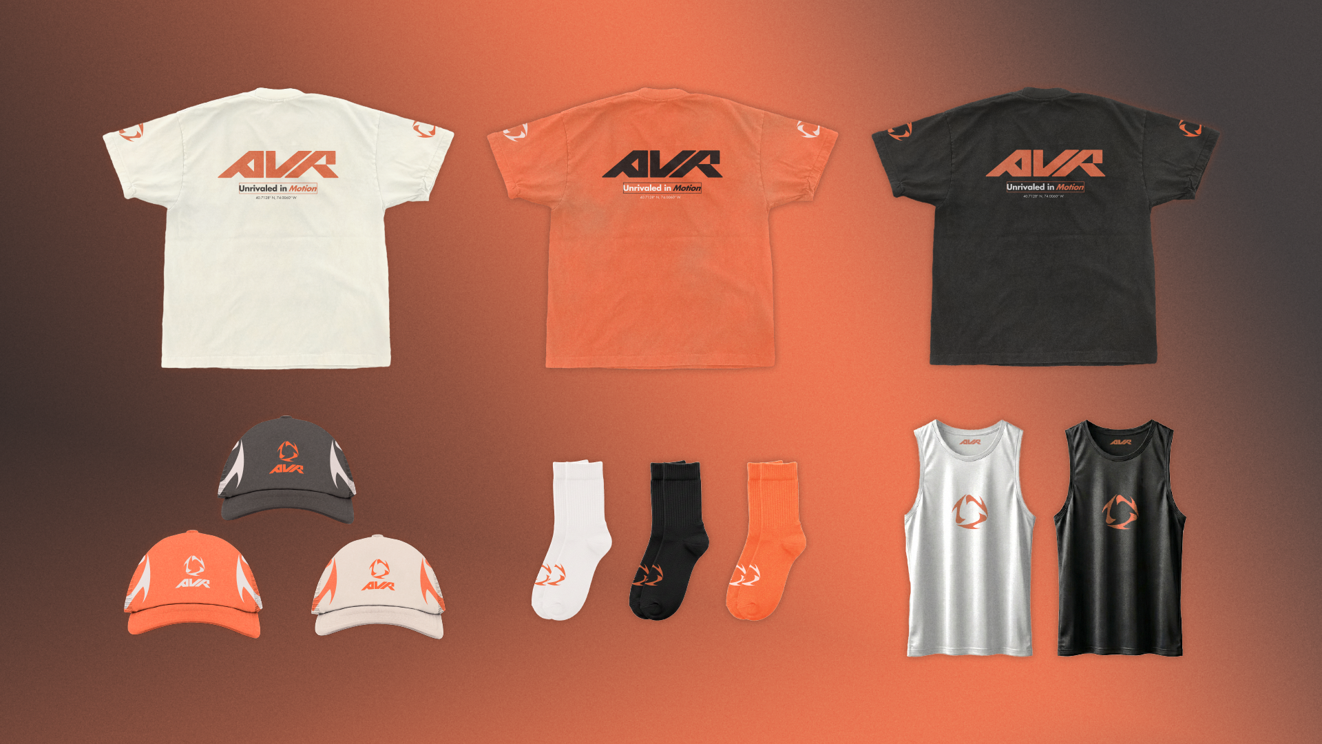
Craft.
Strategy.
Identity.

We build complete brand systems from logo to language that give your business a clear, cohesive presence across every touch point.

Branding Portfolio

Brands designed
0 +
Starting from
0 +
Years of craft
1 -2w
The LARME logo combines bold geometry and emotional symbolism into a single, striking mark. The circular icon cleverly forms the letter “L”, constructed from two sleek, teardrop-like shapes and a dot, subtly referencing teardrops a nod to the brand’s name and its emotional undertone. This interplay of form creates a design that feels dynamic and expressive while remaining highly recognizable.
Orvion Developments LLC is a forward-thinking real estate development firm where architectural rigour meets long-horizon investment thinking. The brand communicates permanence, intelligence, and ambition without noise.
 

A small brand identity project – This project explores the brand identity for a modern, community-driven running club built to connect people through movement. The goal was to create a visual system that feels energetic, youthful, and street inspired while maintaining the structure and credibility of a professional sports brand.

The FORE Golf Club

FORE is a modern golf club brand crafted for the next-generation athlete where calm, culture, and competition intersect. Rooted in a minimalist yet bold aesthetic, FORE challenges traditional golf stereotypes by embracing a new identity: one that is stylish, intentional, and inclusive of youth-driven energy. 

YOKO is a quaint matcha café tucked away on a side street in Tokyo — a hidden gem designed as a pause in the midst of Japan’s fast-paced lifestyle. The brand offers a cozy, meditative space where matcha is not just served, but carefully prepared with patience and respect. The goal of this project was to craft a soothing yet modern brand identity that honors the calm ritual of making matcha while appealing to a younger, design-conscious audience.

YOKO is a quaint matcha café tucked away on a side street in Tokyo — a hidden gem designed as a pause in the midst of Japan’s fast-paced lifestyle. The brand offers a cozy, meditative space where matcha is not just served, but carefully prepared with patience and respect. The goal of this project was to craft a soothing yet modern brand identity that honors the calm ritual of making matcha while appealing to a younger, design-conscious audience.

Ready to build a brand that
lasts?

A great brand is more than a logo. We build complete identity systems color, type, tone, and everything in between so your business shows up consistently everywhere it matters.

– Full logo suite included

– Color palette & typography system

– Brand guidelines & documents

– Social media assests

– All master files delivered

END